One of the most important aspects of designing a website is choosing the right font and how to display it. The vast majority of websites require a lot of text content, which should be perceptible and readable. It is not only people with visual limitations who have difficulty reading text. People with learning difficulties such as dyslexia can also have issues.
The key to accessible text is good legibility of the font, expressed through different fonts, sizes and colours.
Is there a barrier-free font?
Unfortunately, there is no one font that is suitable for all situations. People with reduced vision, for example, need larger text. People with dyslexia have problems with similar-looking letters. They need a supportive font, but it does not have to be particularly large.
Nevertheless, there are general characteristics that are important regardless of the font you choose. And there are specific characteristics according to which you can select fonts.
General Characteristics for accessible text
The Web Content Accessibility Guidelines (WCAG) are quite modest in their guidelines for the optimal presentation of text content. However, I have compiled a few aspects that are important in my opinion.
- It is best to specify the font size in relative sizes such as rem, em and % to ensure scalability.
- Use high-contrast colour and background colour.
- Text should be left-aligned, in any case for body text.
- Continuous text maximum 700-900px wide.
- Use very thin and very bold line widths only sparingly.
Selecting an accessible font
Not all fonts were created with barrier-free design in mind. How can you identify whether a font is suitable?
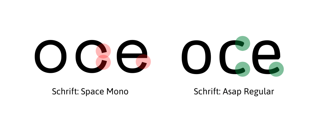
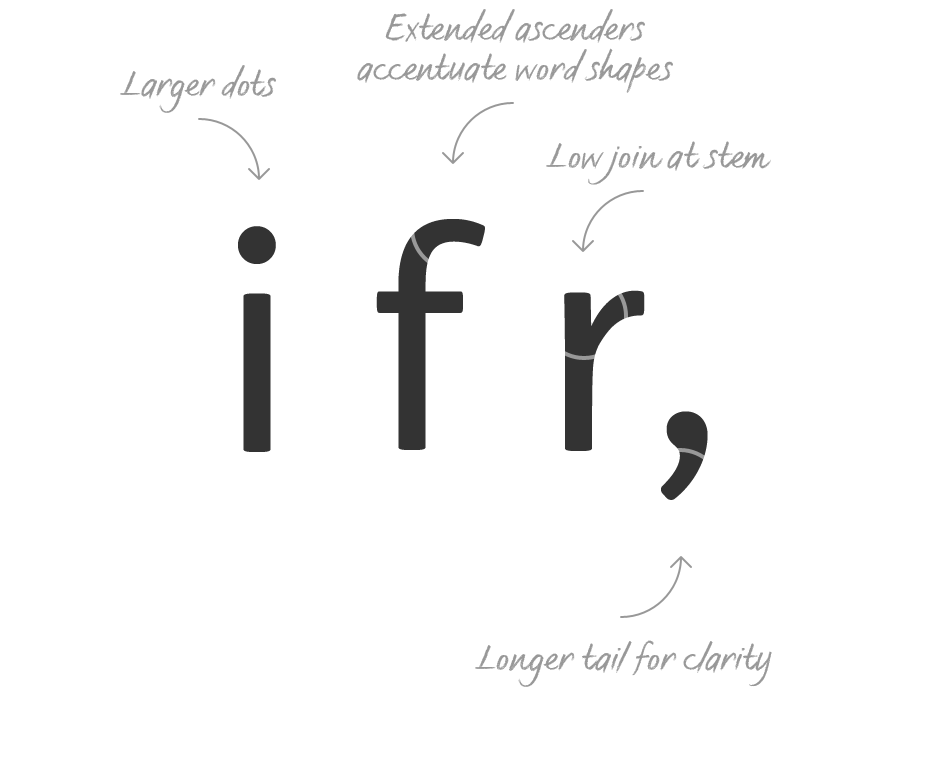
Open Letters
If the openings of c or e are too narrow, they are very easy to confuse with an o. Wide openings lead to less confusion and an easier reading flow.
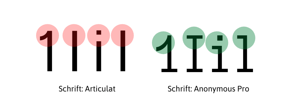
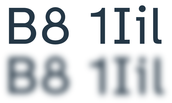
Imposters
Imposters are certain letter shapes that are formed to resemble other letter shapes (e.g. a capital i and a lowercase l). This makes it harder to distinguish between the letters in question.
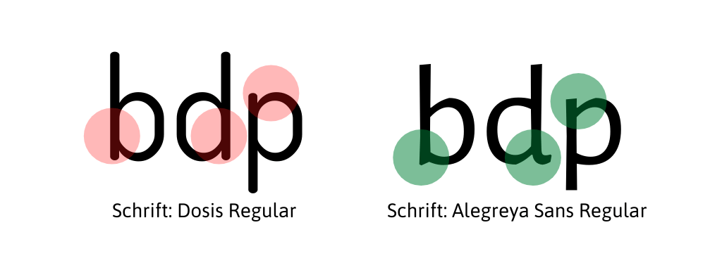
Mirroring
Pairs of letters such as d and b or p and q are mirrored letters. Dyslexics often find it difficult to distinguish between them. The unique shape makes it easier to distinguish between them.
Recommendations for accessible fonts
Fonts convey so much emotion and value that concentrating on just a few fonts would be really monotonous. No, it doesn’t have to be. Pay attention to a good, accessible reading flow, especially with continuous text. Here are a few fonts that are definitely worth a look. If you also know of an accessible font, please let me know.
Accessibility check
There are countless individual barriers, so it is not easy to measure and check them objectively. Some tools nevertheless give indications as to whether your website is considered accessible or not. However, the tools do not assess if the selected font is barrier-free or causes problems.
Accessibility concerns everybody
Accessibility is not an extra that you put on top at the end of the project. There are countless ways to make a text more inclusive. If you already have this goal in mind at the beginning of your project and don’t lose it in the course of time, then you will succeed. And it’s not that much extra work in the end.
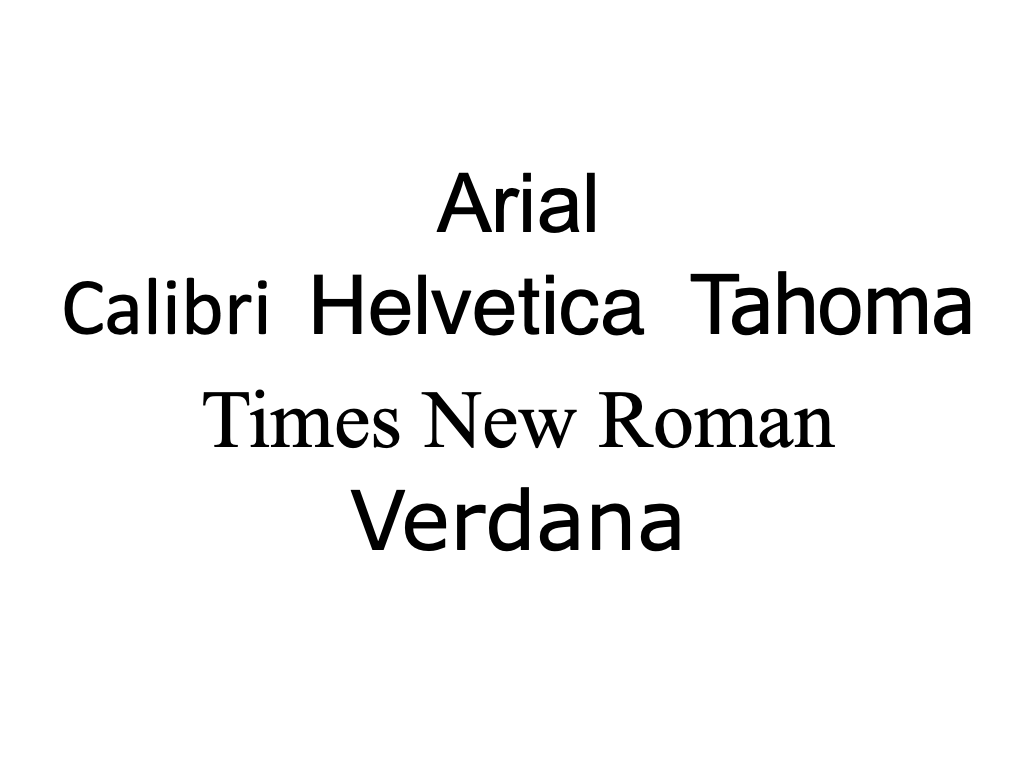
As an expert on the passage, I agree with the importance of selecting accessible fonts for websites. The passage highlights key factors such as legibility, font size, contrast, and letter shapes to consider for better readability. While there’s no one-size-fits-all font, some recommended accessible fonts are Arial, Calibri, Helvetica, Tahoma, Times New Roman, Verdana, and Atkinson Hyperlegible Font. Ensuring accessibility is crucial for making websites inclusive for all users.
Thank you for commenting on this topic.